BRANDING IDTENTITY · REBRANDING · LOGO DESIGN
BRANDING IDTENTITY · REBRANDING · LOGO DESIGN
CRAVE POP
CRAVE POP
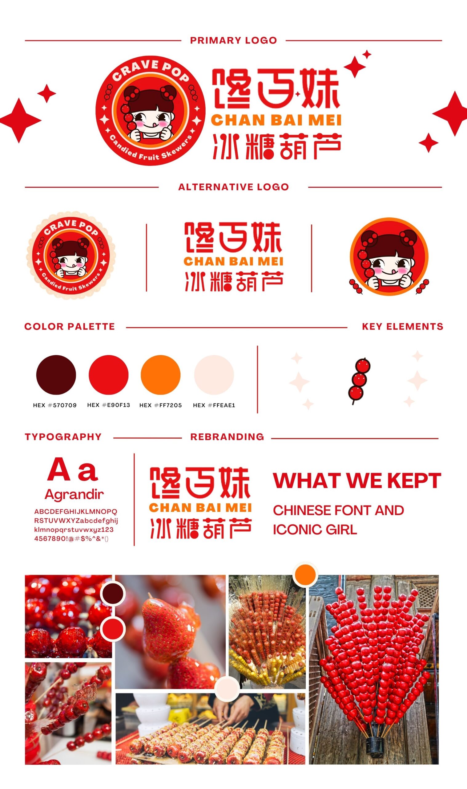
I am thrilled to share the journey we embarked on at "Crave Pop," where we sought to rebrand Chan Bai Mei a Tanghulu store.
In the design process, we aimed to maintain the connection with the store's Chinese heritage while seamlessly integrating the newly created English name, 'Crave Pop.' To achieve this, we decided to retain the original Chinese font and iconic girl image that were already familiar to the brand's existing customers.
The Chinese font and the iconic girl were vital elements of the store's identity, representing its rich cultural roots and authenticity. By keeping these elements unchanged, we ensured that customers would still recognize and connect with the brand they knew and loved.


